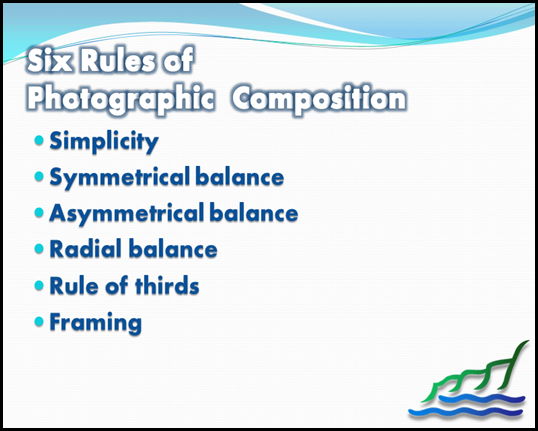
Tonight’s session was a class on Photographic Composition. In the visual arts — in particular painting, graphic design, photography and sculpture —composition is the placement or arrangement of visual elements or ingredients in a work of art, as distinct from the subject of a work. It can also be thought of as the organization of the elements of art according to the principles of art.
The term composition means 'putting together,' and can apply to any work of art, from music to writing, that is arranged or put together using conscious thought. In the visual arts, composition is often used interchangeably with various terms such as design, form, visual ordering, or formal structure, depending on the context. In graphic design and desktop publishing, composition is commonly referred to as page layout.
Follow these photography tips to learn how to compose your subject in an asymmetrical fashion. Rather than simply centre-framing your subject, which can get a little boring and repetitive for both cameraman and viewer, experiment with moving your central object a little to the left or right. This creates interest and challenges you to add interest to other areas in the photograph.
The Rule of Threes
The rule of threes suggest you divide an image up into equal parts (3 parts across and 3 parts down), and that anything you wish to focus upon in the picture should be laid across the lines that divide these parts. In human photography, it is often used to centre the body and line up the person's eyes with one of the horizontal lines.
Asymmetrical composition can break the rule of thirds (by not having the person on one of the lines) or by not placing the subject in proportion to the other thirds. It can also follow the rule by placing the focus of the shoot into one third of the photograph. This asymmetrical composition draws the viewer into the picture.
Symmetry
One thing that can put a viewer off the photograph more than anything else is the use of symmetry which doesn't quite work out. If you are using symmetry, then it has to be absolutely symmetrical, or it is pointless. A deliberately asymmetrical photograph may not even be noticed by the viewer, as it looks more natural and less formally composed. Photography tips will often advise against symmetry simply due to the likelihood that complete symmetry will be missed.
Unintentional Symmetry
Along with not-quite symmetry, a common amateur mistake is to have accidental symmetry of objects in the photograph. You may, for example, take an asymmetrical photo of a child, only to notice later that they are in exactly the same angle as a power line, shadow or tree. These kinds of accidents are best avoided, as they can give a sinister and unpleasant look to what would be a simple photograph. Before taking the picture, check that there are no reflected symmetries in the background.
Harmony
Although a photograph can be asymmetrical, that doesn't mean that they are not pleasing to the eye. The Rule of Thirds helps any composition to achieve harmony: even if two parts of the picture appear empty, while the other third is 'busy', these thirds are actually working together to focus the eye. The only time that an asymmetrical photograph is not in harmony is when the subject has lent itself to a symmetrical composition. In this case, an asymmetrical picture may be jarring and alarming to the viewer. Mostly, however, photos are simply better and more entertaining when they are composed asymmetrically.
We ended the the session by looking at Kodak’s Top Ten Tips for taking great photographs.
If you’d like to see the Top Ten Tips, click here!


No comments:
Post a Comment