Continuing on from where we left off last week, tonight’s session was about creating posters. Last week we did a handful of A4 sized posters for various events. Care and attention was paid to the font style and colour of the posters.
Tonight, we worked on creating a long banner, and also a look at creating large posters.

Rachel’s poster in class printed out on 16 pages, in the format of 4 x 4. All she had to do was trim the overlap that Microsoft Publisher allowed, and stick the pages together. You could use scissors and selotape, or a guillotine and a glue stick – the choice is yours. The more time you spend on it the more professional looking the end result. If you are printing a poster to be hung outside, you could even cover it with sticky-backed plastic, to make it rain proof.
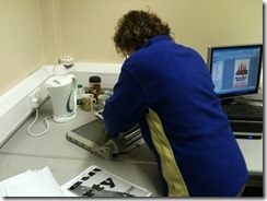
Above, Rachel and Huw piece together a poster created in Microsoft Publisher. Its a time consuming process, but worth it in the end.
Here we see Rachel with the finished poster – impressive I’m sure you will agree!


No comments:
Post a Comment